CLIENT
Pixel
MY ROLE
Lead Designer
TEAM
Brenda Cortes, Madison Hewlett
At Pixel, we empower global brands to captivate digital-first consumers with innovative product launches. Our latest rebrand introduces a bold, sleek, and timeless presence. We’ve crafted a visual brand that reflects our commitment to pushing boundaries and delivering exceptional results in a digital-first world.


Where We Started
Our previous branding was minimalistic and cohesive, but it didn't capture the modern edge and dynamic spirit that define Pixel’s innovative services. We recognized the need to evolve to better align with today’s digital-first audience and showcase our professional expertise in a more contemporary way.

How It’s Going
We rolled out this successful branding across all channels and on the website, leading to a significant boost in brand awareness and client impression. The refreshed look has enhanced our visibility, making us more recognizable and appealing to our target audience.

Designed by Cross Bernal
The Pixel
A screen is made of tiny pixels. These pixels are essentially just three colors: red, green, and blue.
Combined, they can create any image you can think of.
We use the “Pixel” as a graphic element to convey our branding and company values. With a simple block, we can enhance, build, and bring ideas to life.
The Approach
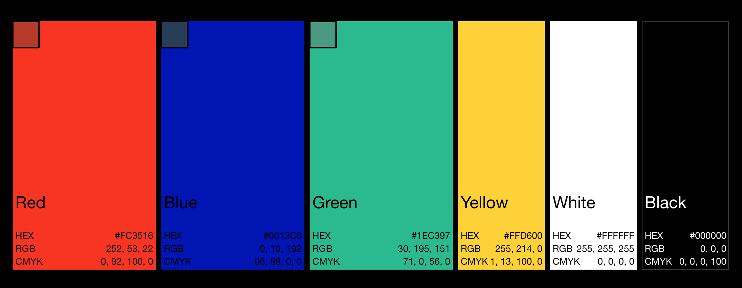
Bold type. New colors. Snazzy design.


The Roll Out
Pixel’s rebrand has been seamlessly implemented across all channels. Clients have been thrilled with the transformation, and the update has strengthened our brand awareness and identity.